I had the pleasure of working with a local female-owned woodworking business and helping them redesign their logo. Like many small business owners starting out, Black Arrow Customs had created a simple logo to get their business up and running. As their business grew, they knew they needed to update their brand to take it to the next level. You can view their original logo below.
Alisha Griffith, the owner of Black Arrow Customs, reached out to me with her vision in mind. She wanted to incorporate the rustic/ruggedness of trees and woodworking into the logo, while also having a sense of feminity to it. She had already had the color palette in mind of olive green, black, and blush pink.
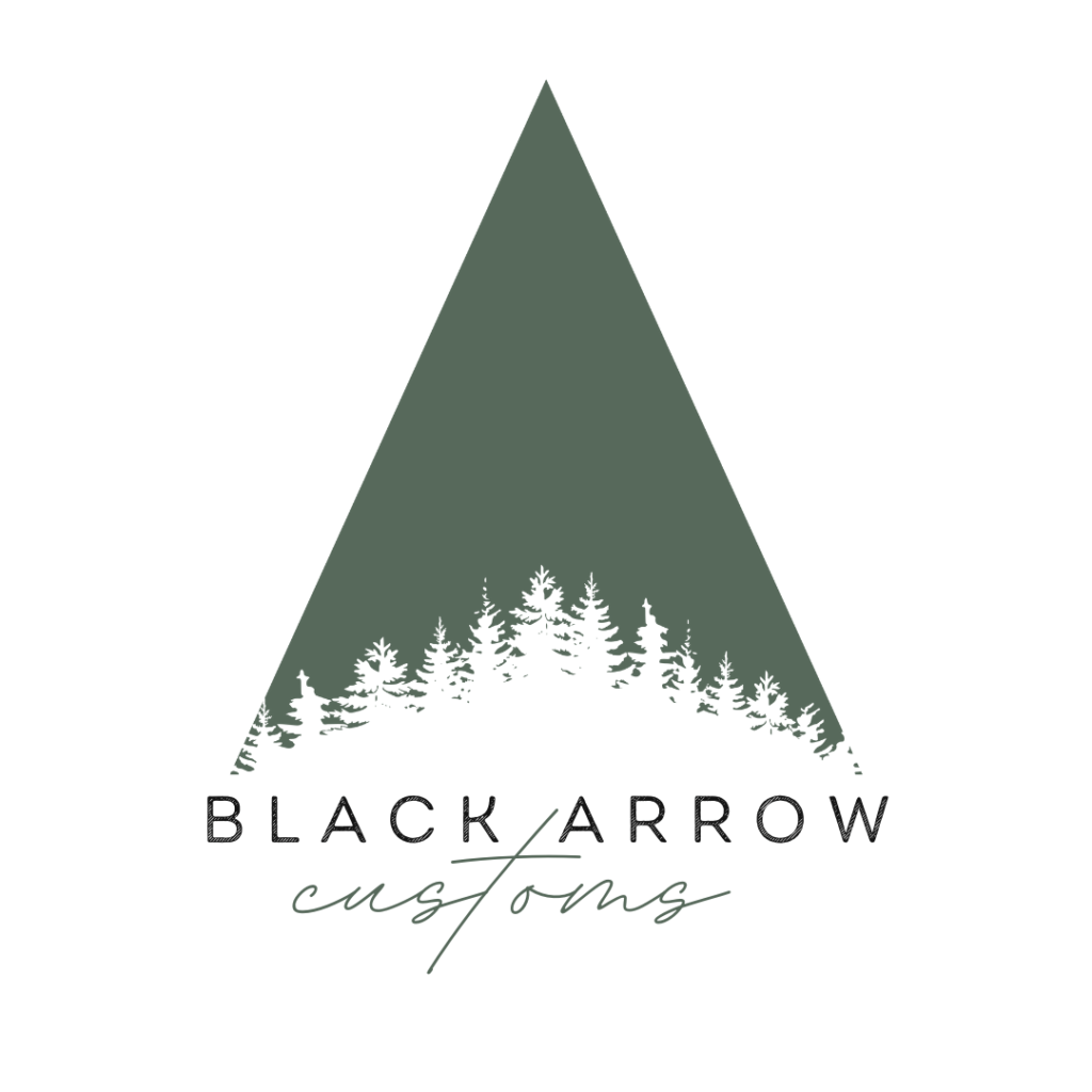
I’ll admit it took a few different renditions of this logo design to get it right. Originally, I had attempted to incorporate the original arrow design into the logo, but it wasn’t quite capturing the vision that Alisha had for the logo. After a few conversations, I started playing with the silhouette of the pine tree and came up with the design below. After some consideration, the pink did not work as well with the design, but the script font provided a hint of feminity that tied everything together.
You can view some of Black Arrow Customs’ designs on their Instagram and Facebook. They also have a website where you can contact them directly and learn more about their services.
https://www.instagram.com/blackarrowcustoms/


