Back in 2019, I started planning my wedding, right before the pandemic hit. Our timing could not have been more perfect because we got married in November of 2019. We had a very short engagement and I was advised to wait a little longer, but I am glad we didn’t. The process of choosing a venue, color theme, and dinner menu was so much fun that I still find myself looking at wedding content. As my business started growing, I wanted to create a mock brand to showcase some of my work and I decided to create Sunset Ridge Weddings & Events. While I was planning my wedding, I noticed how many venues desperately needed a website and so I wanted to combine two passions, wedding content and brand design.
Choosing a Color Theme
I live in the Smoky Mountains so it was natural for me to choose a location that had mountain views and stunning sunsets. I also wanted to capture the blue/green hue the mountains sometimes get during a sunset and incorporate an orange color to continue on with the sunset theme.

Deciding on Typography
It took me a little time to land on the right font for this brand because it could have went a couple ways. Since this is a wedding and events venue, it could have been natural to go with a nice flowy, script font. However, it didn’t feel right when designing the logo. I had a couple iterations that just didn’t work and landed on a simple serif font paired with a simple san serif font.

Designing the Logos
Normally, I would start with the primary logo when designing a brand, but I needed some type of graphic or element to contrast the font. I found this half circle foliage gaphic and I was reminded of a wreath hanging on a door that felt welcoming and warm. The addition of the foliage kind of replaced the feel of the script font by creating some dimmension and flow. That is how I landed on the secondary logo design and then was able to easily design the primary logo around that.
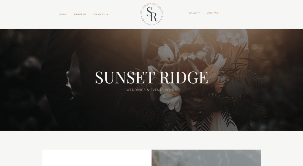
Once this color palette, font, and logos were designed, it was time to start planning the website. I found some free stock images online from Pexels so that I could create a website template that actually felt like a real website for a wedding venue. If you click the image below it will take you to the full site.
If you liked this website and branding design, I’d love to work with you. Scroll down to the Meet The Author section and click the work with AWD button to learn more.
